Components
Generally, you will want to build your own components to add visual interest to your pages. Markdown is excellent for text content, but is not designed to deal with layouts.
This template has several components that you can use as a reference for your own projects. It is recommended to view this directly on the website, as it shows both the code to create a component and what it looks like when the website is running.
Tip
All the style information for these components can be found in public/css/markdown.css, if you’d like to make edits to the look and feel of them.
Card Select
A card select in this context refers to a navigation panel comprised of images. The example below shows an of a card select for a collection of selectable characters in a video game.

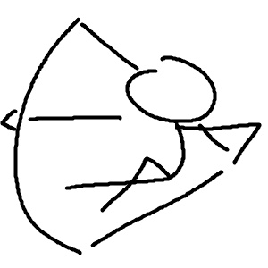
Caster
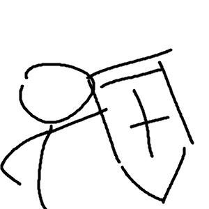
Duelist
Fisher
Hero

Prophet
Runner
Scout
Sentinel
::: cardSelect
- [ ](/caster/) <p>Caster </p>
- [ ](/caster/) <p>Duelist </p>
- [ ](/caster/) <p>Fisher </p>
- [ ](/caster/) <p>Hero </p>
- [ ](/caster/) <p>Prophet </p>
- [ ](/caster/) <p>Runner </p>
- [ ](/caster/) <p>Scout </p>
- [](/caster/) <p>Sentinel</p>
:::
Each line represents a card. The format is relatively obtuse, but it can be broken down into three parts:
- The image:
 - The link:
[content to display](/caster/) - The text:
<p>Caster</p>
Essentinally, links can have content in them. This is often text, but it can also be images. For styling purposes, a <p> tag is added at the end of the image.
The default card select layout makes labels optional, but it is recommended to include them to make navigation easier. Additionally, the other layouts use them.
Overlapping Label
Puts the text overtop.
-
Caster
-
Duelist
-
Fisher
-
Hero
-
Prophet
-
Runner
-
Scout
-
Sentinel
::: cardSelect--labelOverlap
- [ ](/caster/) <p>Caster </p>
- [ ](/caster/) <p>Duelist </p>
- [ ](/caster/) <p>Fisher </p>
- [ ](/caster/) <p>Hero </p>
- [ ](/caster/) <p>Prophet </p>
- [ ](/caster/) <p>Runner </p>
- [ ](/caster/) <p>Scout </p>
- [](/caster/) <p>Sentinel</p>
:::
Framed
Puts the label underneath, and gives each card a frame.
-
Caster
-
Duelist
-
Fisher
-
Hero
-
Prophet
-
Runner
-
Scout
-
Sentinel
::: cardSelect--framed
- [ ](/caster/) <p>Caster </p>
- [ ](/caster/) <p>Duelist </p>
- [ ](/caster/) <p>Fisher </p>
- [ ](/caster/) <p>Hero </p>
- [ ](/caster/) <p>Prophet </p>
- [ ](/caster/) <p>Runner </p>
- [ ](/caster/) <p>Scout </p>
- [](/caster/) <p>Sentinel</p>
:::
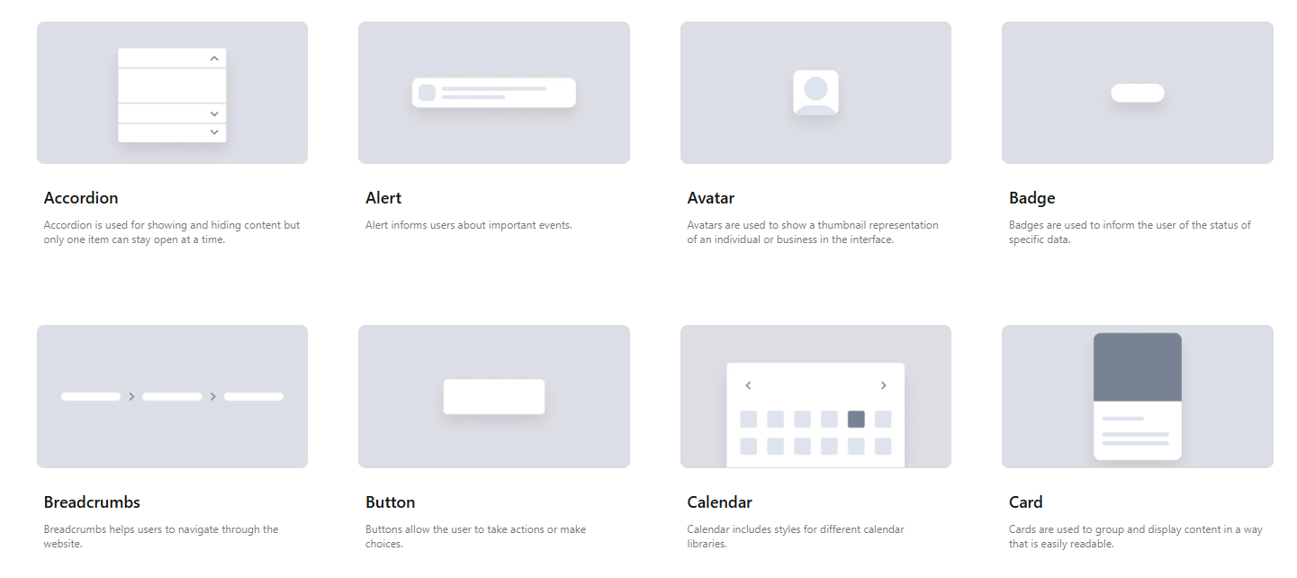
Examples
The main use case of ca
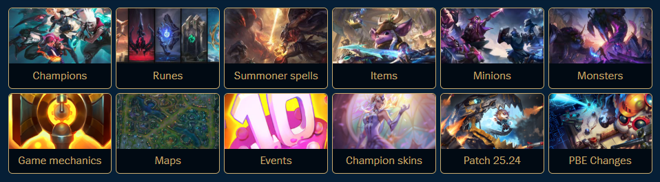
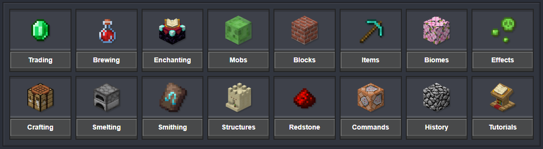
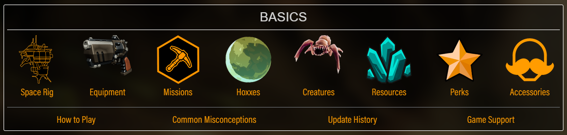
A card select is very common on the home page of many wikis. This makes it somewhat of an odd choice to include for a documentation website template, as most typically have a table of contents always visible, but this project doesn’t have that since it’s not meant for code documentation.
Despite that, there is some usage of card selects, specifically in CSS libraries for showing components:
Scaled Up Images
If your documentation uses pixel art, you can use the scaleUpImage container to render it at the maximum size.

Depending on the type of art, it may be better to create custom containers that render up to a specific size (especially for tall images).
List with Multiple Columns
Lists are useful, but when you’re listing down items, generally the names are pretty short. That makes it awkward to have a long list because it takes up so much vertical leeway. This project uses Markdown containers to easily create multi-column lists, ranging between 2-4 columns.
Two Columns
- one
- two
- three
- four
- five
- six
- seven
- eight
- nine
- ten
::: multiColumnList--2
- one
- two
- three
- four
- five
- six
- seven
- eight
- nine
- ten
:::
Three Columns
- one
- two
- three
- four
- five
- six
- seven
- eight
- nine
- ten
- eleven
- twelve
::: multiColumnList--3
- one
- two
- three
- four
- five
- six
- seven
- eight
- nine
- ten
- eleven
- twelve
:::
Four Columns
- one
- two
- three
- four
- five
- six
- seven
- eight
- nine
- ten
- eleven
- twelve
::: multiColumnList--4
- one
- two
- three
- four
- five
- six
- seven
- eight
- nine
- ten
- eleven
- twelve
:::
Considerations
As a fallback to ensure readability, elements with lots of content will try to wrap to the next line. This prevents text from overlapping, but will often cause issues in the formatting.
- one
- two
- three BUT MAKE IT SUPER LONG !!! 😄
- four
- five
- six
- seven
- eight
- nine
- ten
::: multiColumnList--4
- one
- two
- three BUT MAKE IT SUPER LONG !!!!!! :D
- four
- five
- six
- seven
- eight
- nine
- ten
:::
If you want to squeeze a list into as small of a vertical space as possible, use the column count that keeps all elements as a single line of text. This may require that you have a lot of unused space if a single element is notably longer than the rest.
- one
- two
- three BUT MAKE IT SUPER LONG !!! 😄
- four
- five
- six
- seven
- eight
- nine
- ten
::: multiColumnList--2
- one
- two
- three BUT MAKE IT SUPER LONG !!!!!! :D
- four
- five
- six
- seven
- eight
- nine
- ten
:::
Multi-Column Lists with Icons
In the majority of wiki’s (that I’ve seen), multi-column lists usually have each element with an icon beside it, almost always in the form of a list of links to that are categorized together.
Here is a multi-column list where each icon is from the tilemap posted earlier on this page.
 (unused)
 up_right_2
 up_left_2
 right_up_1
 right_up_2
 left_up_1
 left_up_2
 (unused)
 (unused)
 up_right_1
 up_left_1
 right_down_1
 right_down_2
 left_down_1
 left_down_2
 (unused)
 (unused)
 down_left_2
 down_right_2
 full
full (unused)
 top_left
 top_right
 (unused)
 (unused)
 down_left_1
 down_right_1
 (unused)
 (unused)
 phoenix
 bottom_right
 (unused)
Clickable Links
Multi-column lists with clickable links are relatively unwieldy to write, but can still be done in Markdown.
::: multiColumnList--4
- [ Caster ](/caster/)
- [ Duelist ](/caster/)
- [ Fisher ](/caster/)
- [ Hero ](/caster/)
- [ Prophet ](/caster/)
- [ Runner ](/caster/)
- [ Scout ](/caster/)
- [ Sentinel](/caster/)
- [ Caster 2](/caster/)
- [ Duelist 2](/caster/)
- [ Fisher 2](/caster/)
- [ Hero 2](/caster/)
- [ Prophet 2](/caster/)
- [ Runner 2](/caster/)
- [ Scout 2](/caster/)
- [ Sentinel 2](/caster/)
:::